Mega Menu Redesign
Designing a flexible nav for FLIR’s diverse markets.
Summary
I led UX / UI for FLIR’s redesigned top nav, which provided quicker navigation to our top / mid funnel Solutions pages and a clearer view into FLIR’s dozens of product categories.
Role
UX/UI design in the early phase; Project Management once approved for development.
Why
When we launched the redesigned FLIR.com in early 2018, we knew one of its flaws was the top navigation. You can see below what the Products navigation originally looked like:
Usability testing confirmed our assumptions: Customers found this list of 59 product categories completely overwhelming.
Additionally, we wanted to surface some of the excellent landing page content we were building under the Applications menu, but we had no flexibility with the current nav system. We wanted to tell stories about FLIR’s solutions for a variety of industries and applications, but users could only get to them by visiting one of these top-level application pages and navigating to a sub-page.
Solution
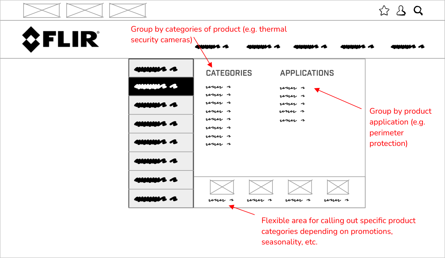
A redesign of the Information Architecture was not doable at the time, so I proposed we implement a flyout-based navigation that would force the user to identify their intended application / industry (Security, Marine, R&D, etc.) before displaying all the sub-categories. I put together a few wireframes to explore options and explain how it could work:
Solutions and Products nav wireframes (we ended up choosing a simpler approach for the Products nav
The overall direction was approved and I then moved onto polished UI design. I created a fairly elaborate set of prototypes, which you can view here (we opted for rev 3, option 4).
This is the final design for our mega menu:
I then project managed the implementation with our external partner to ensure the nav worked flawlessly in all browsers and for all screen sizes.
Results
While it’s difficult to peg a specific number to this customer experience improvement, we did notice fewer complaints from customers and employees about difficulties navigating our product categories. It’s also likely that the improved navigation played a role in our 49% eComm revenue growth and 110% lead growth over the last couple years.


